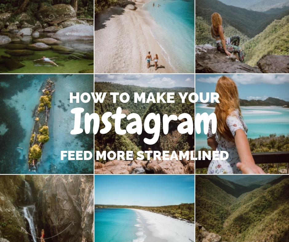
Do you want to create a beautiful Instagram feed but for some reason you can’t get it to look coordinated? Worry no more! In this post I will guide you through 3 easy steps on how to make your Instagram feed look more streamlined.
Related posts:
- How to get more Instagram Story Views
- How to Grow and monetize your Instagram
- How to Start a Travel Blog
- How to Take Better Photos (for Instagram)
Step 1: Choose a theme
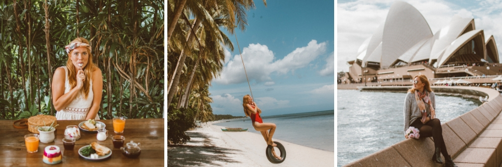
The first place to start if you want your profile looking cohesive and streamlined is by choosing a theme. This could be golden (like me), vintage (like Tezza), pastel (like Morgylh) or something else, feel free to be creative!. Think about the type of content you will be able to produce and what sort of style this will suit.


In order to keep a unified theme on my instagram I use my Lightroom editing presets. These help me to keep the colours in my photos looking similar, and adds my signature golden glow look, it also makes editing a lot easier and quicker. I edit on desktop but they do have a free mobile app. Learn how to make your own presets to keep your photo aesthetic the same.
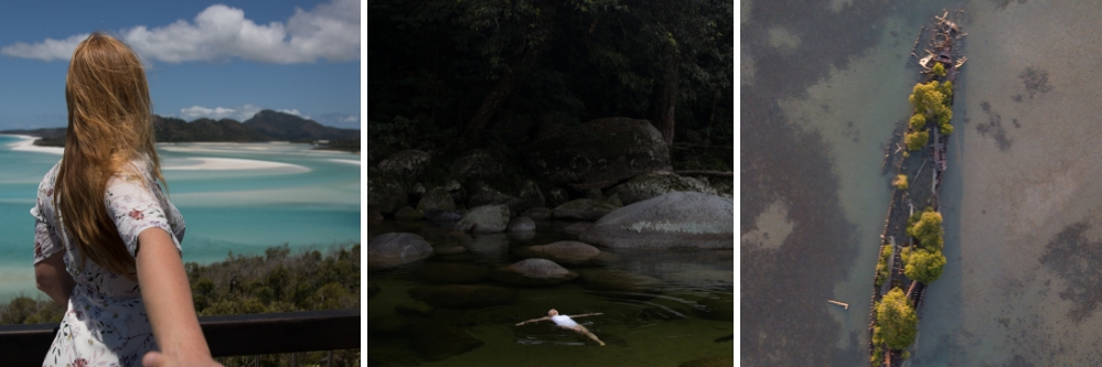
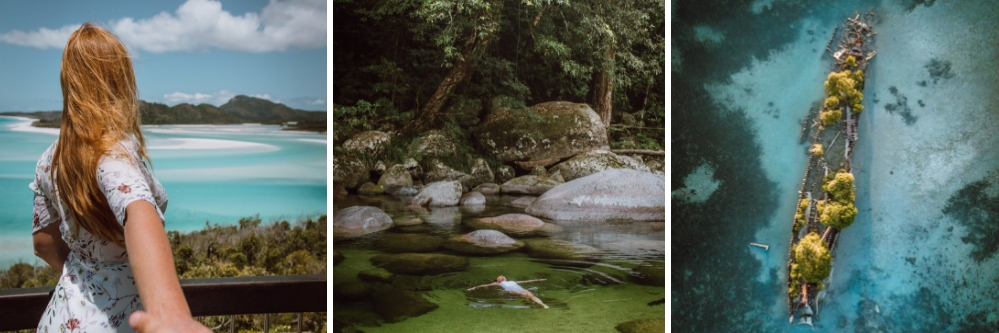
Below you can see three photos with no edit, and then three photos using my Golden Glow Pop preset. Can you see how not only to they pop out but they blend better together?
Another one of my presets gives a Golden Film effect similar to Tezza. It works well with a variety of photos and will help give that vintage look to your feed.
You can learn more about the different tools on Lightroom with my ultimate guide or learn how to edit a vintage film effect or soft pastel effect. I also have a guide to editing like DoYouTravel.
If you are not very experienced at editing then a good place to start is using presets sold by other Influencers. Get 20% off my presets (available for both desktop and mobile) using code streamlinedinsta10.
The VSCO app is also a good way to pick a theme as they have a range of different filters you can buy. A lot of instagrammers start using VSCO and then move to Lightroom so that they have more flexibility when editing their photos. Learn more about how apps can help your editing.
Step 2: Maintain a similar composition within your photos
Another easy way to keep your profile looking streamlined is by keeping the composition of your photos similar.
1) If you can see the horizon on your photo try to upload it to line it up in the same place as neighbouring photos on your feed. You can do this quite easily in Instagram thanks to the grids that appear when you are uploading an image.
2) If you like minimalist photos with not much in, stick with this. If you prefer busy pics (landscapes etc), stick with this.
3) Take your photos at a similar time of each day so that the light in your photos stays the same.
Step 3: Plan ahead
Even if you maintain a similar editing style that doesn’t mean that all of your photos will go well together, there are just too many different colours in the world! Plan your posts in advance so the colours in your feed will seamlessly flow together.
I use an app called Preview, this way I am able to upload my new content and see how it will work with the rest of my feed. I usually plan about 9 posts in advance, making sure all of the colours go together. If you are using a similar editing style or filter this will be a lot easier to do.

If you have trouble working out which photos ‘go together’ when you are planning your feed here are my top tips:
- Try breaking it down. Think about the 4 photos that each post is connected too – do the colours blend well? does the light or darkness of the photos go together?
- Post photos from a similar place together as the colours will be similar too. In Preview you can swap photos round to see which ones work best where.
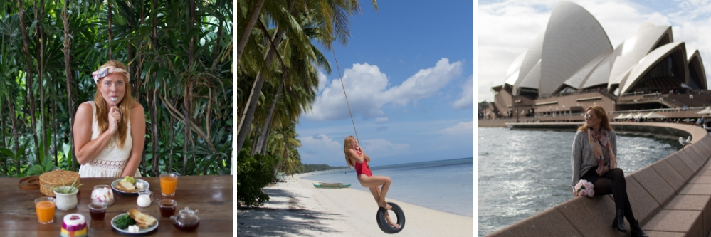
- Use the diamond effect. For example you might post a blue then green, blue, green, blue green photos so the colours line up on your feed in a diamond shape (see the photo to the right).
- Don’t put a similar photo directly above another. For example if I have 2 waterfall photos I would put 3 photos between them rather than 2. This then avoids me ending up with one waterfall pic over the other surrounded by a load of non-waterfall pics.
- Try initially taking photos in a similar style and grouping them together. For example Ofleatherandlace has gone from pink pastel to dark purple to autumn red.

")
")
Best of luck making your Instagram look more streamlined, if you want to learn more about how you can improve your Instagram check out my ebook.
Like this post? Pin it to save for later!
")
")

4 Comments
How to Grow & Monetize your Instagram - ebook - The Ginger Wanderlust
November 12, 2018 at 5:26 am[…] How to make your profile look more streamlined […]
How to create a vintage film effect on Lightroom (edit like Tezzamb) - The Ginger Wanderlust
November 12, 2018 at 5:28 am[…] Using the same presets on your photos is a great way to maintain a streamlined instagram feed. […]
Lisaauskiel
November 12, 2018 at 9:02 pmGreat work ?
How to Get More Instagram Story Views - The Ginger Wanderlust
November 3, 2019 at 8:56 am[…] How to Make Your Instagram Feed More Streamlined. […]