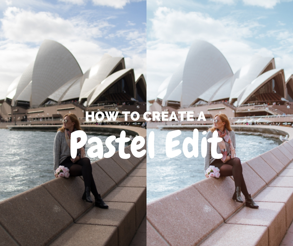
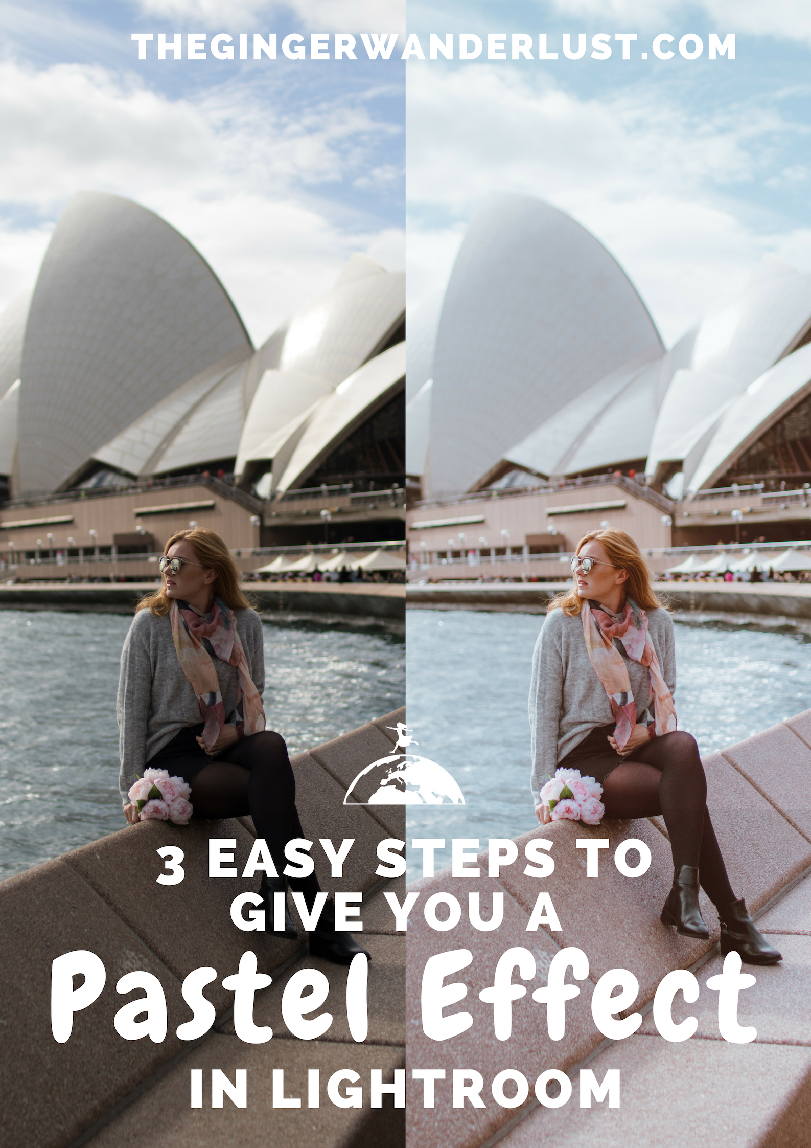
In this tutorial I will walk you through the process of creating a beautiful soft pastel effect in Lightroom in 3 easy steps. It is no surprise to me that the pastel look is a popular edit for Instagram, not only does it work across a variety of images (thus giving your feed a streamlined look) it’s also very cute! If you want to learn more about creating a streamlined profile and growing your Instagram, check out my e-book!
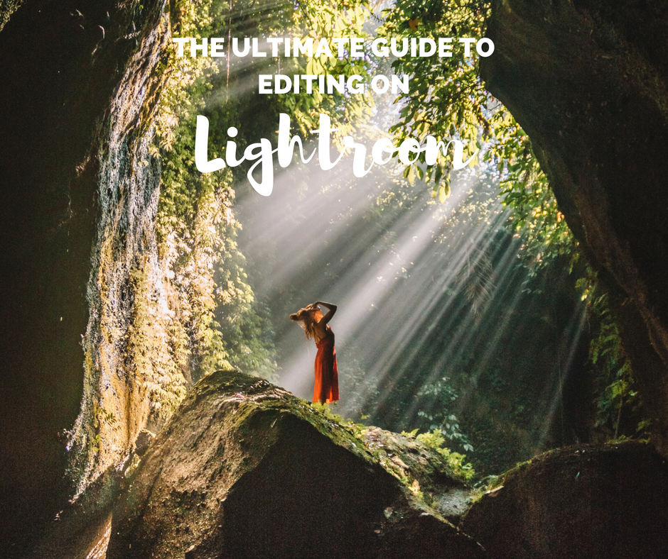
There are a few different tools you will need to change on Adobe Lightroom in order to get the soft pastel effect. My blog post aims to seamlessly guide you through the process! My Ultimate Guide to Editing on Lightroom will help you to understand all of the different editing tools on Lightroom.


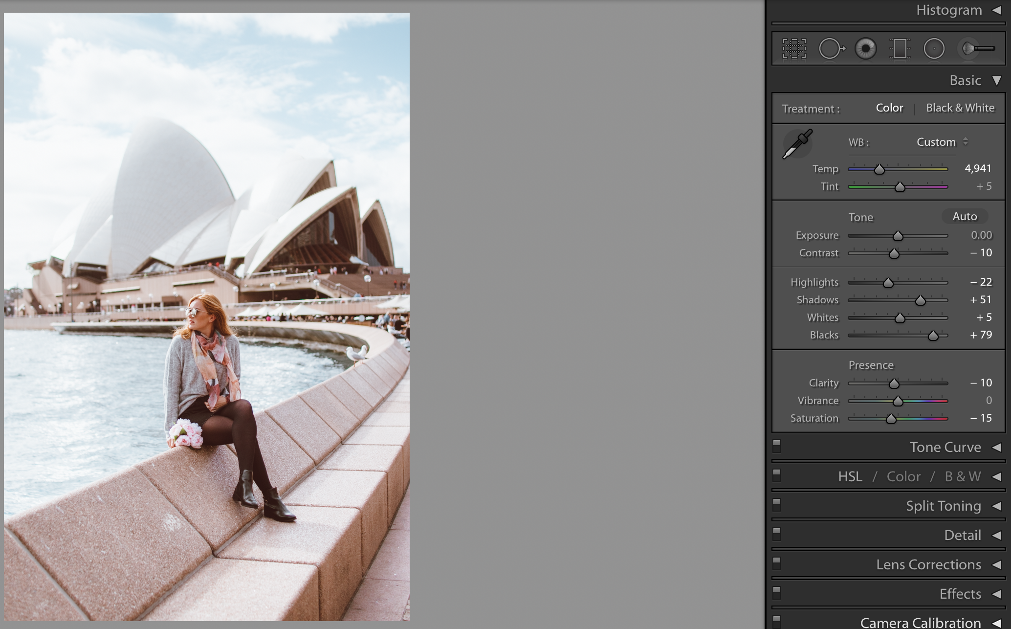
Step 1: The Basics
The place I always start when editing on Lightroom is with the basic selection in the develop module. Here you can alter the light within the photo.
To achieve the pastel effect you will need to lighten your photos:
- You might want to increase exposure a bit (the amount will depend on the light in your photo)
- Decrease contrast
- Slightly increase or decrease the highlights (this affects the background so will depend on the photo)
- Increase shadows (brightens the foreground)
- Slightly increase whites
- Increase blacks
- Slightly decrease clarity (gives a bit of a dreamy feel)
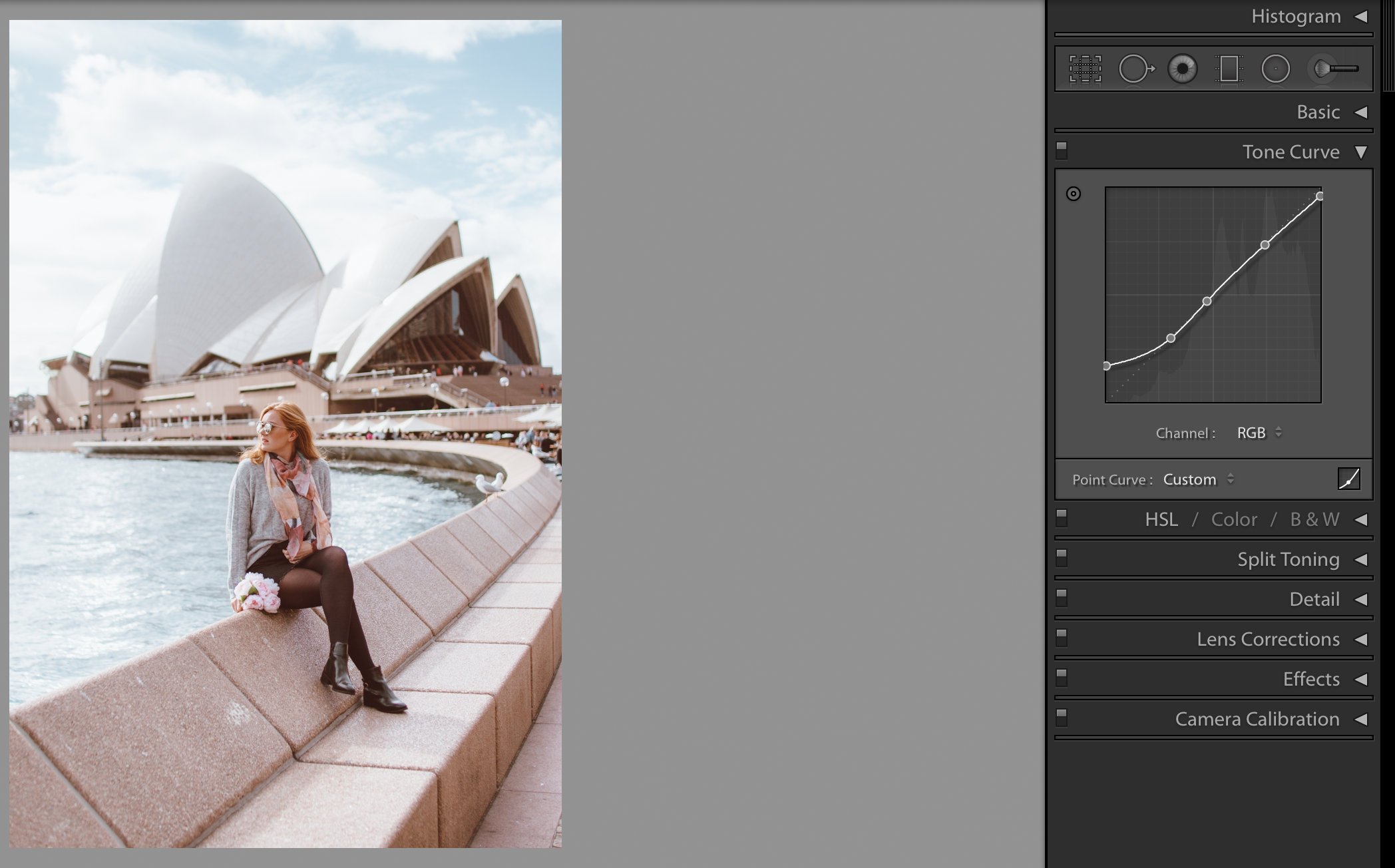
Step 2: Tone Curve
The next thing to edit is the tone curve. The tone curve helps you to redefine what is considered pure black and pure white, meaning you can change the different light and dark tones within your photo.
To soften your photo you will need to slightly raise the left end point on the RGB curve. As you lift it up you will notice that the blacks will fade a bit and the photo will look a bit matte.
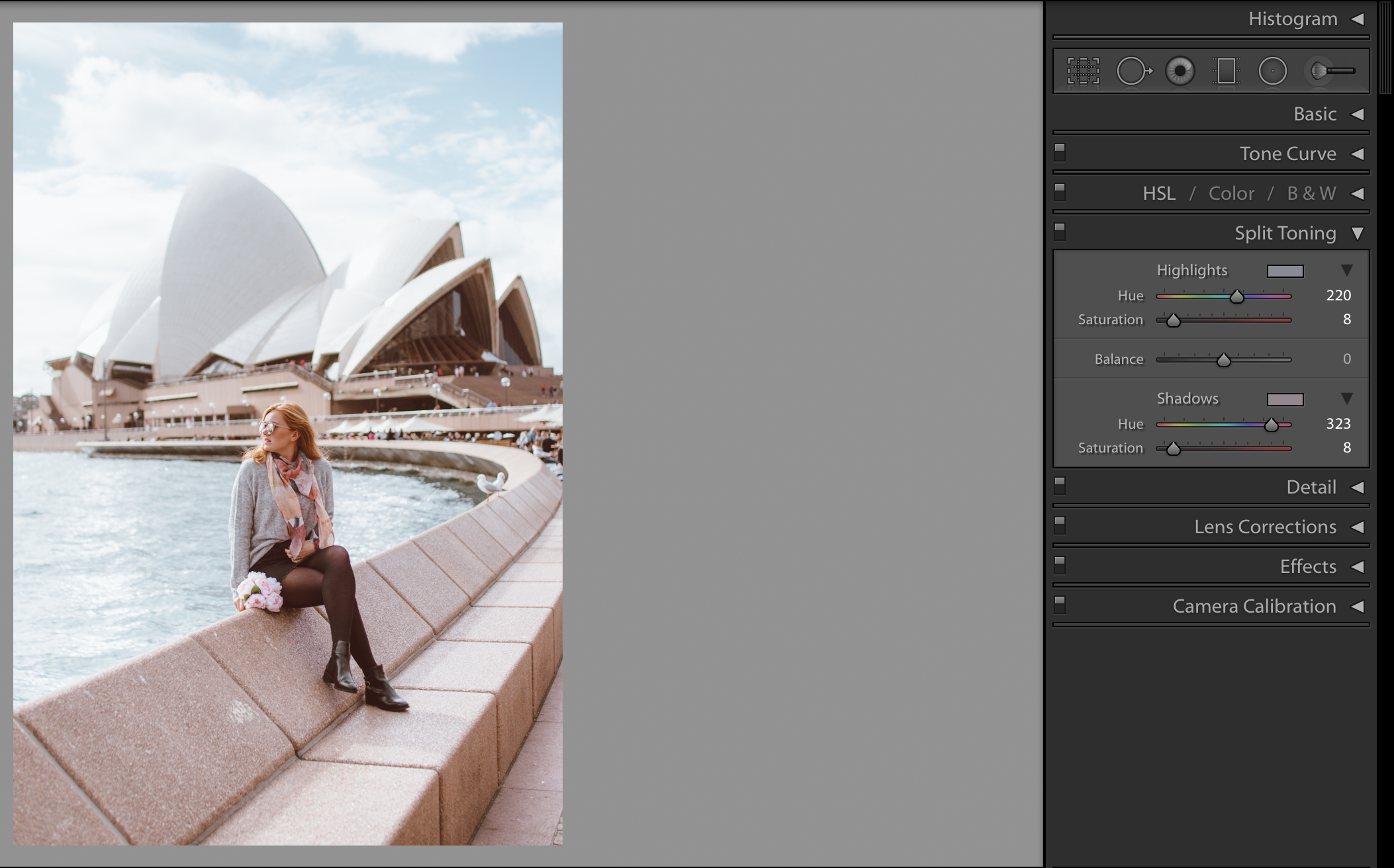
Step 3: Split Toning
By now your photo should look softer and lighter and less vibrant. To finalise the soft pastel effect you will need to use split toning, this is a great complement to the soft matte look added in the tone curve. Below you can see the edit without split toning and with, you can see how the blue highlights and pink shadow help to add a nice pastel effect.


For the highlights settings I would use 220 hue and 8 for the saturation, this will add a soft blue effect to the background. For the shadows settings it will depend on your photo but I think a pink hue is nice, I get this with 323 hue and 8 for the saturation.
For final touches you can then play around with the colours (HSL). What you do here will depend on the colours in your picture. For a nice pastel sky decrease the blue hue and luminance a bit. You might also want to decrease the saturation of most colours (especially yellow) and increase the luminance. Learn more about all Lightroom tools in my Ultimate Guide to Editing on Lightroom.
A good way to better understand the editing process, is by buying presets. Presets are filters that you can use within Lightroom, that will change your photo in one click, and you can then see what changes have been made in the different tools, and adjust them to suit your photo (if necessary). From these presets you can learn how to make your own presets. You can find mine in my shop, I even sell individual presets if you only want one as an example). Here I used my Golden Glow Pop preset and then changed the settings to give a more pastel effect.
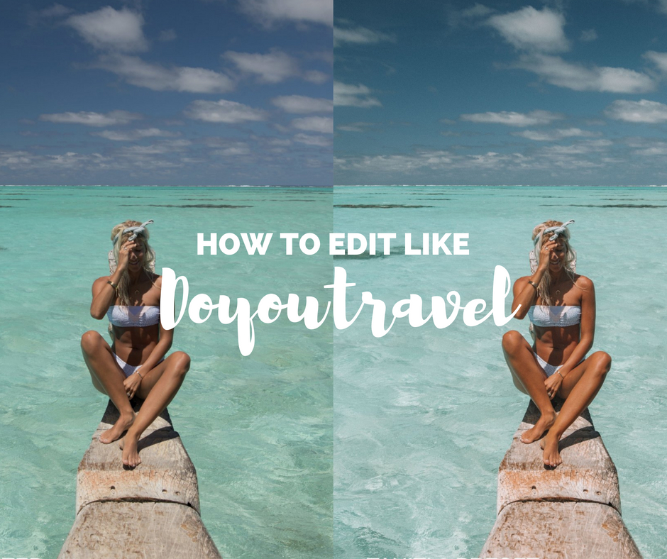
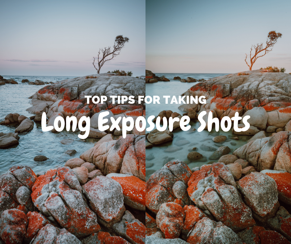
Check out blogs on editing styles that you might like:

Like this post? Pin it to save for later!

1 Comment
Li L Ying
April 28, 2020 at 2:07 amThanks for that!!